
ⓘ Disclosure: This post contains affiliate links. If you buy through one of them, I may earn a small commission at no extra cost to you. As an Amazon Associate I earn from qualifying purchases. Images in this post are AI-generated virtual design concepts intended for inspiration. Linked products reflect the style and feel of the space, but are not exact matches.
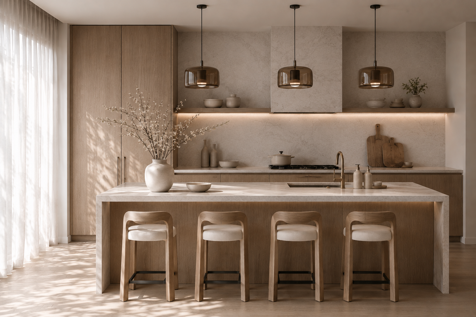
Some organic modern kitchens are almost entirely neutral and still feel warm, layered, and quietly expensive.
Others have the same cream cabinets, pale stone, and wood accents — and somehow just look beige.
The difference usually isn’t the size of the renovation. It’s how the undertones, materials, texture, light, and contrast work together. And most of that you can fix without touching the cabinets.
Here’s what I’d change first.
Shop the Organic Modern Kitchen Edit
Some links below are affiliate links — I may earn a small commission at no extra cost to you.
If you’re working with a kitchen you already have, don’t start with a basket of small accessories. Start with the pieces that create the biggest visual shift — then add the smaller layers only where the room still needs them.

First, Make Sure Your Neutrals Actually Relate
This is the least exciting part of a neutral kitchen — and probably the most important.
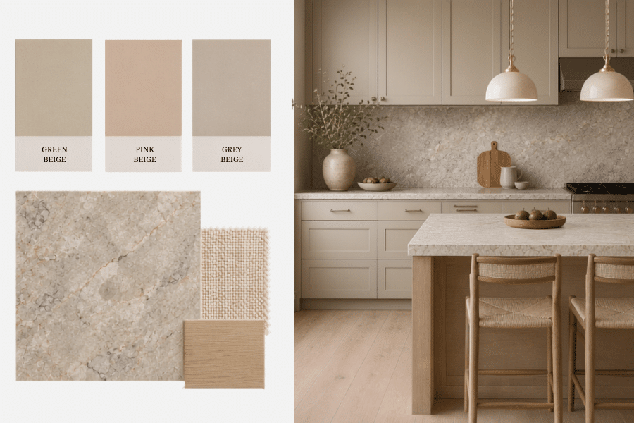
Two colors can both be called beige and still fight each other. One leans pink, another leans green or yellow, and then the stone adds cream, gray, or rust veining on top. That’s often what creates the vague feeling that something is “off,” even when every finish is beautiful on its own.
The fix isn’t making everything the same color. It’s finding the undertones already in the room and repeating them on purpose — if your stone runs warm cream, bring that cream into the cabinetry; if it has brown or green veining, echo one of those tones somewhere smaller.
And always look at samples inside your actual kitchen. Morning light, afternoon sun, and evening bulbs change beige more than you’d expect.
Neutral doesn’t mean everything matches. It means everything relates.
Then Give It the Contrast It’s Missing
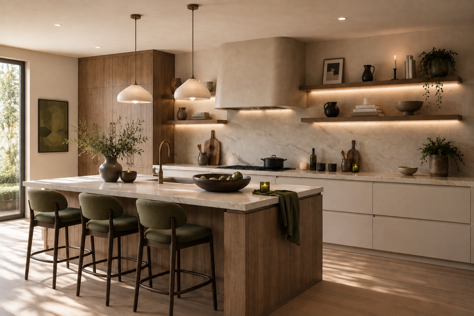
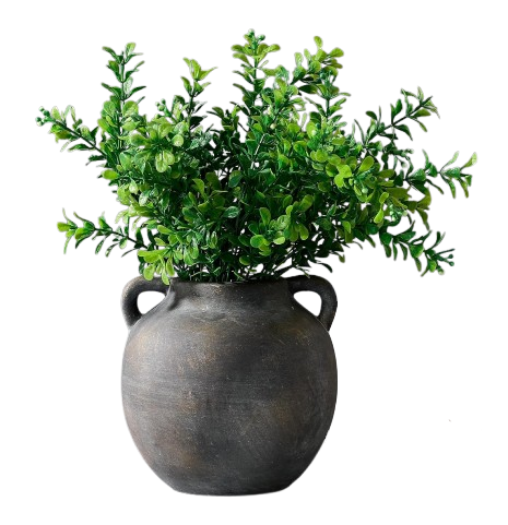
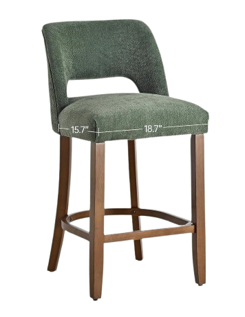
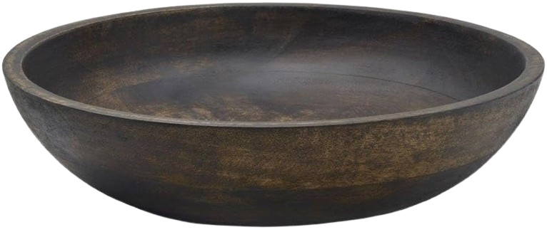
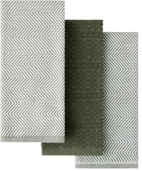
Once the undertones agree, look at contrast. This is where most beige kitchens fall flat: cream cabinets, pale oak, oatmeal stools, ivory rug, cream vase. Nothing is wrong — there’s just nowhere for your eye to land.
I like to add one medium or deeper natural note before adding any more decor:
- walnut or medium oak
- warm brown or muted olive
- aged brass or bronze
- soft black
- a small amount of rust or burgundy
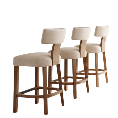
You don’t need all of them — please don’t use all of them. One or two repeated through the room is enough. A walnut stool against a creamy island adds far more depth than another beige accessory ever could.
A calm room still needs contrast. It just doesn’t need noise.
Not sure where to start?
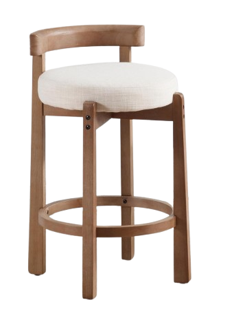
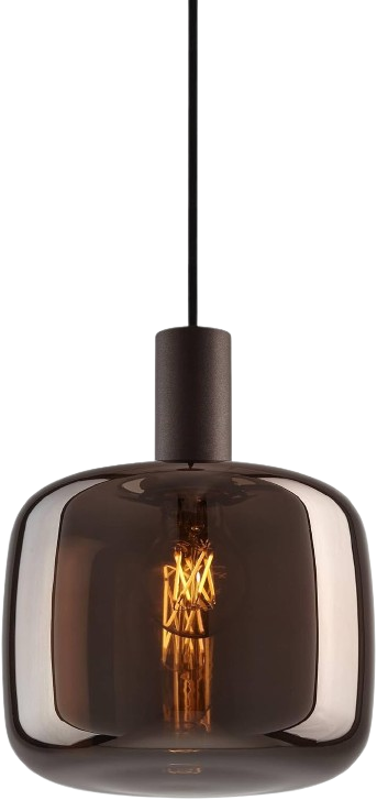
Lighting and counter stools do the most work in an organic modern kitchen.
Why Lighting Can Make a Neutral Kitchen Look Flat
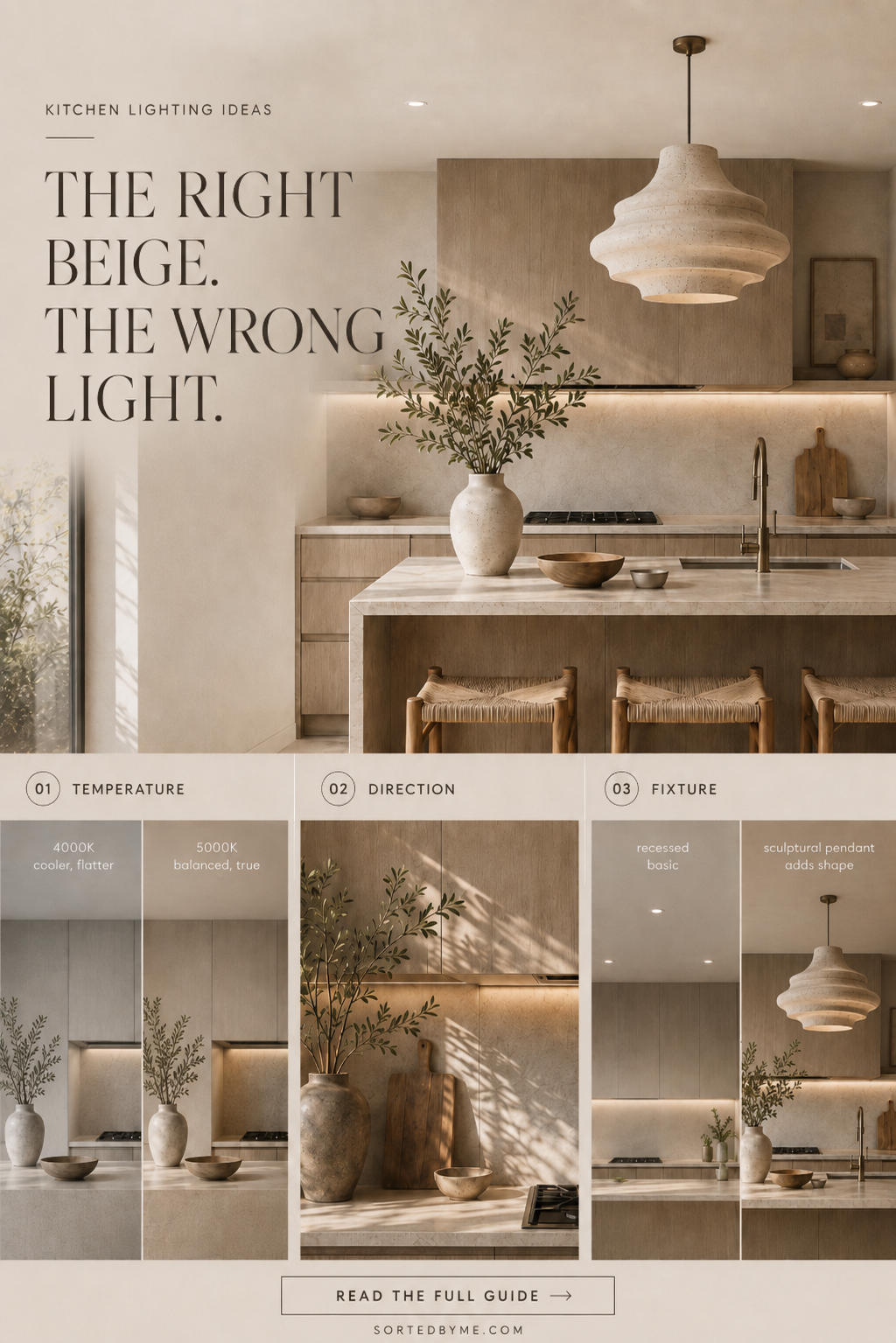
When a neutral kitchen feels flat, it’s easy to blame the beige. But before changing the cabinets, stone, or paint, look at the light you’re seeing them in.
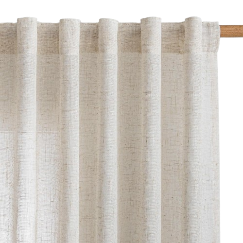
Lighting can completely change how a neutral kitchen reads. The same cream cabinet can look soft and dimensional in natural daylight, gray under cooler artificial light, or overly yellow when the lighting is too warm. Beige is especially sensitive because its undertones shift with the light around it.
That’s why some of the best kitchen lighting ideas aren’t really about adding more fixtures. They’re about choosing light that lets the materials already in the room do their job.
Look at three things first
1. Light temperature
Cooler light can pull gray or green undertones forward, while overly warm light can make cream and beige feel muddy or yellow. Before changing a finish, look at it in morning light, afternoon light, and under your evening lighting.
2. Direction of light
Flat, even lighting can make a neutral kitchen lose depth. Directional daylight and well-placed fixtures create small shadows across wood grain, stone veining, plaster, and handmade surfaces. Those subtle shifts are what make a quiet palette feel layered rather than blank.
3. The fixture itself
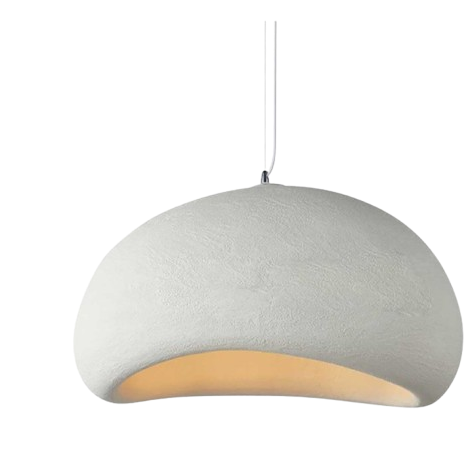
A pendant isn’t only there to produce light. In an organic modern kitchen, it can introduce scale, shape, contrast, and another material into the room. A sculptural pendant gives the eye somewhere to land during the day, while layered lighting makes cabinetry and stone feel softer at night.
Before changing your beige cabinets, change the light you’re seeing them in.
Then let texture do the rest
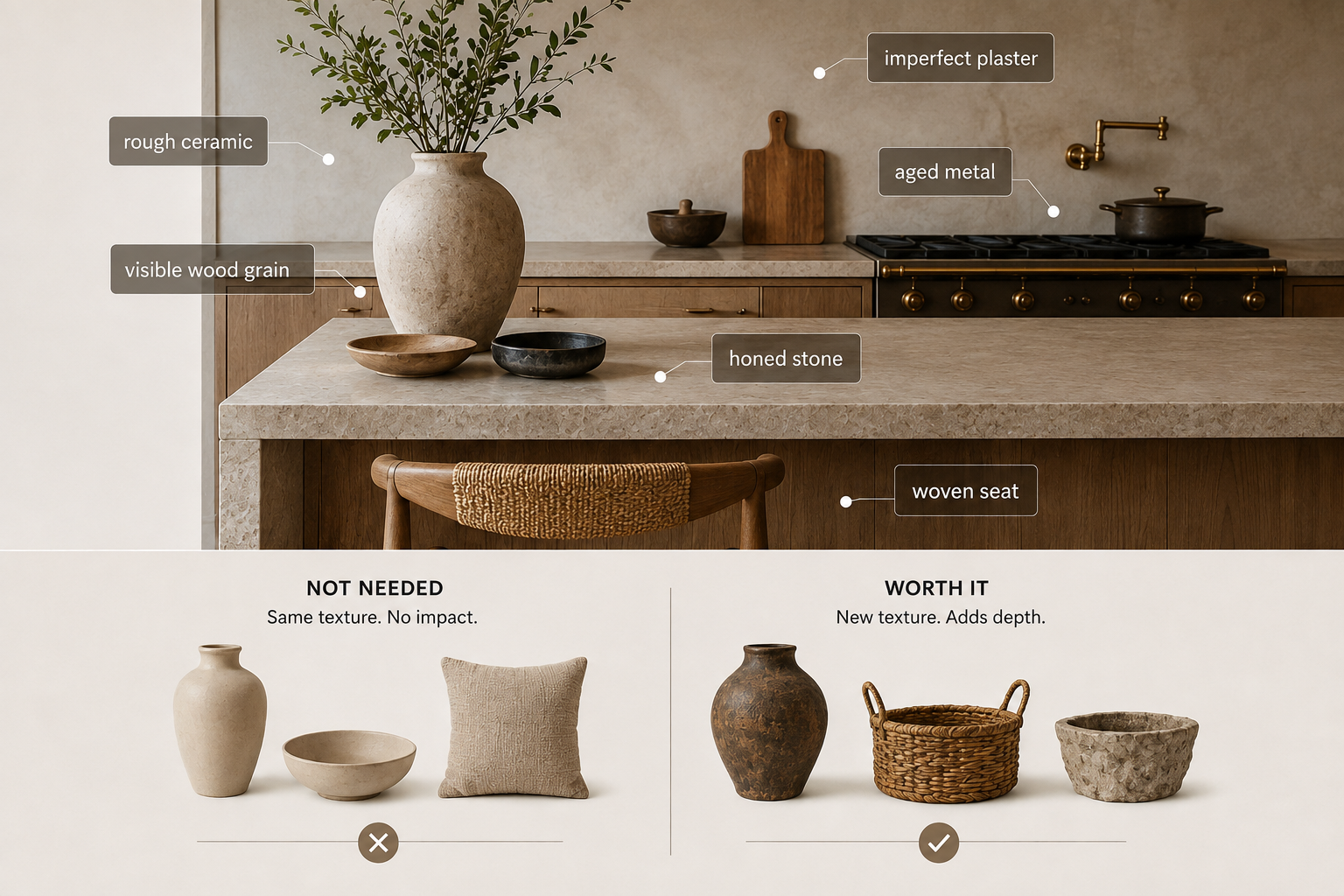
When color is restrained, texture does the heavy lifting. Zoom in on a neutral kitchen that feels expensive and you’ll usually find more texture than color: visible wood grain, honed stone, woven seating, matte ceramic, aged metal, or a slightly imperfect plaster wall.
The colors barely change. The surfaces do.
So instead of adding another beige object, I ask one question:
Does this bring a new texture into the room?
If the answer is no, I usually don’t need it.
Try mixing:
- matte + slightly reflective
- smooth + rough
- soft + solid
- refined + a little imperfect
The goal isn’t more decor. It’s enough variation in light, texture, and material that the neutral palette has something to reveal.
Style in Moments, Then Leave Space
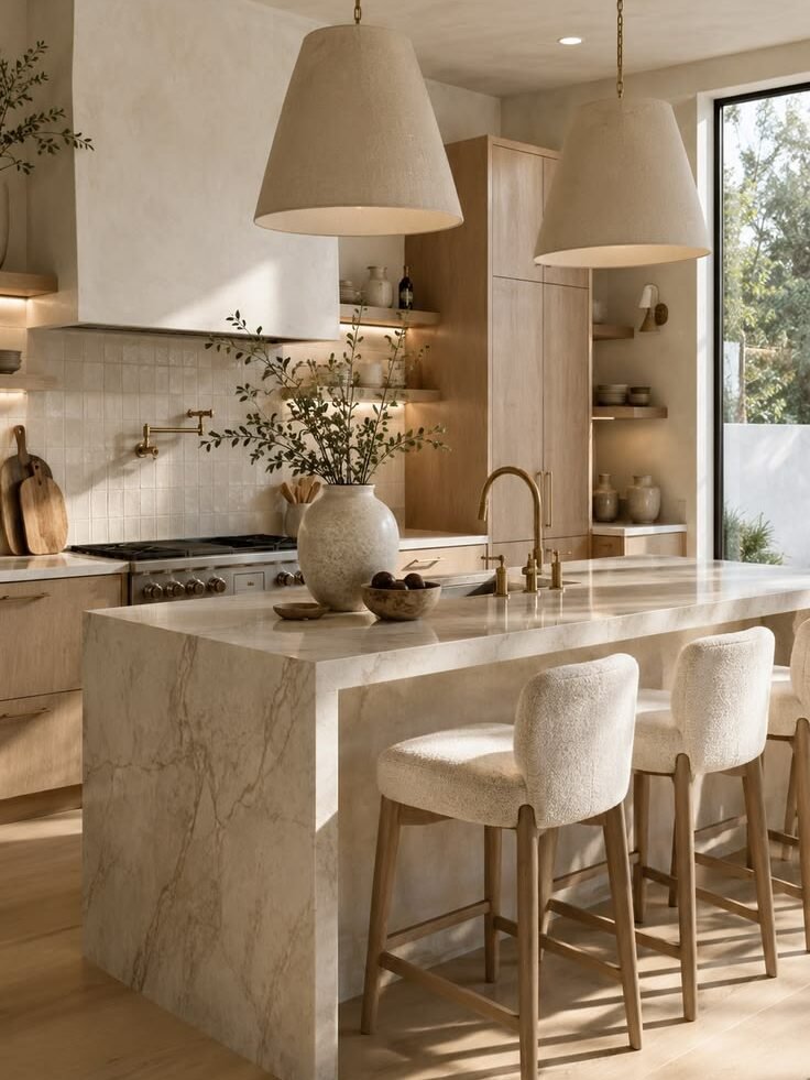
My favorite organic modern rule costs nothing: leave something empty. When every stretch of counter has a vase, board, candle, tray, and cookbook stack, the natural materials disappear behind the decor.
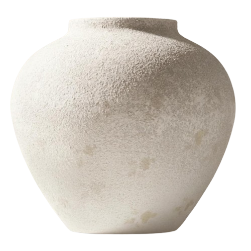
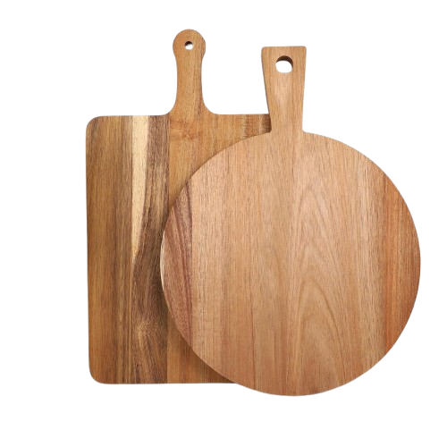
Make one stronger group instead — a substantial cutting board leaned on the backsplash, one larger ceramic vessel with imperfect branches, a low stone bowl — then give it room. One oversized piece almost always feels more expensive than five small ones scattered around it.
If a counter already feels busy, take everything decorative off one section and add it back slowly. Keep an object only if it earns its place with at least one of these:
- Function
- Texture
- Contrast
- Height
- Personality
What I’d Buy First
If your kitchen already has cream cabinets and a neutral counter, you may not need to touch the foundation at all. Start with whatever creates the biggest visual shift, in this order:
| Piece | What it changes | Where I’d shop it |
|---|---|---|
| Pendant lighting | adds shape, scale & warmth in one move | Check Price → |
| Counter stools | a medium wood tone or woven texture breaks up a pale island fast | Check Price → |
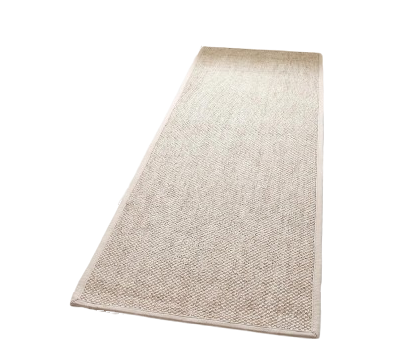
| Runner | the easiest way to slip in olive, brown, rust, or a little pattern | Check Price → |
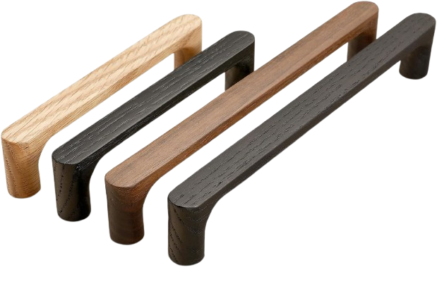
| Hardware | one repeated warm metal makes the whole kitchen feel considered | Check Price → |
| One large countertop piece | a beautiful board, oversized vessel, or stone bowl | Check Price → |
| Useful objects worth leaving out | a pepper mill, utensil crock, or fruit bowl that’s functional and part of the styling | Check Price → |
Only once those are working would I add smaller decor.
The Takeaway
A neutral kitchen doesn’t need more — it needs the few right things to relate. Get the undertones agreeing first, add one deeper natural note for contrast, let texture and light do the work color isn’t, and then leave a little space so the materials can breathe. Almost none of that requires touching your cabinets.
If you only change one thing this week, start where the eye lands: the lighting and the counter stools. They shift the whole room faster than a cart full of small decor ever will.
Beige isn’t the problem. A room with nothing to relate to is.
Ready to shop it? Jump back up to the Organic Modern Kitchen edit ↑ — or browse the full Shop the Look for the rest of the home.